building a Visual
Grammar
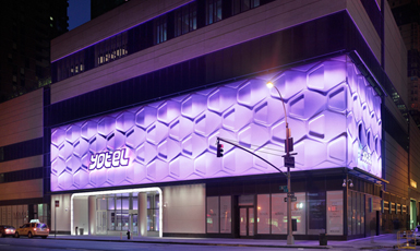
Yotel New York is a new flasgship lifestyle hotel in the heart of Manhattan’s theater district. The first city center hotel from the inimitable airpot hotelier, it aims to attract an adventurous and visually savvy clientel.
When Yotel opened in the fall of 2010, their brand DNA was fairly well defined, what was missing was how to express that DNA in a sophisticated and meaningful way. My task was to help them develop a visual grammar which would help them express their brand truth in refreshingly compelling ways.
Brand truth is a foundation that finds
its expression through visual grammar.
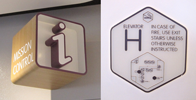
Setting aside the brand guidelines, I looked to the hotel itself for visual inspiration. What were their guests experiencing? What quirky componants of the hotel stood out? I had to ask myself, did the brand grow out of the hotel experience, or did the design of the hotel grow out of the brand? Rhetorical questions aside, the hotel was rich in inspiration from which to begin creating ownable visual assets.
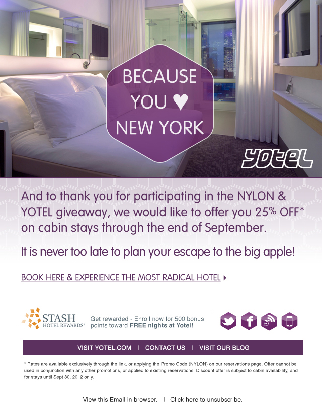
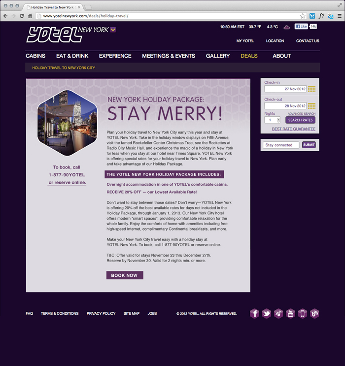
Email blasts were the first communication vehicles for exploring the new visuals. A Yotel purple hexagon features prominantly along with the creative directions of “Work. Stay. Play”, which perfectly captures the dual personality of Yotel as a hotel that works as ahrd as it plays.